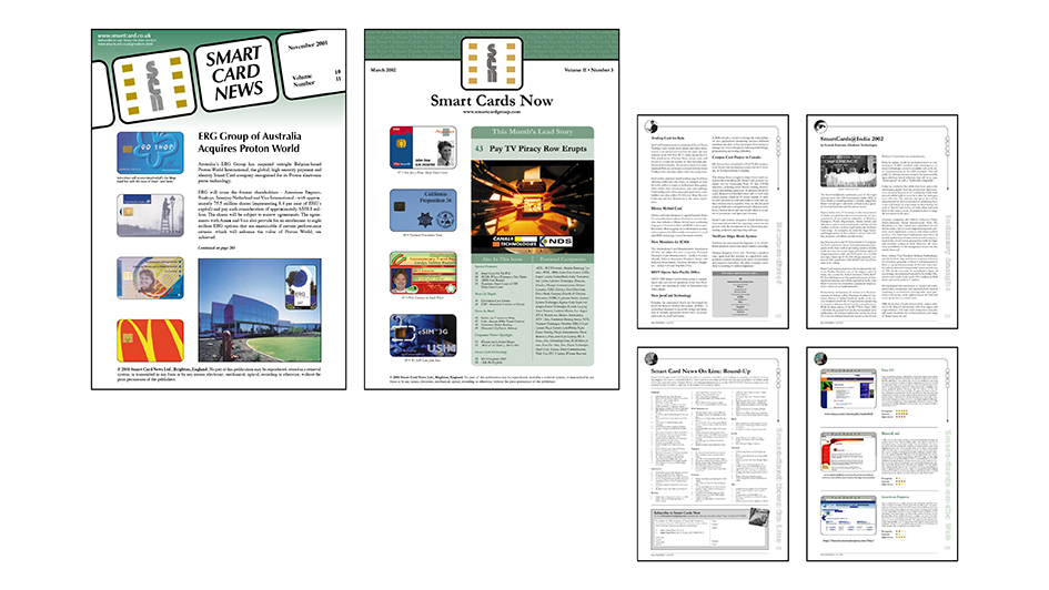
Smart Card News, the monthly newsletter. I introduced a Quark Xpress workflow for this publication, moving it away from Word processing to professional level production, including the pioneering use of Acrobat PDF for prepress direct-to-plate production.
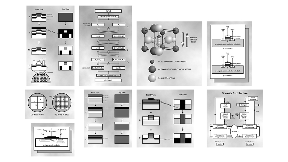
Technical illustrations for smart card tutorials. These were created using hand-written notes, often very quickly, and almost always in spite of my limited technical understanding. The tutorials were incredbly popular, and very widely read when they were collated for publication on the website.
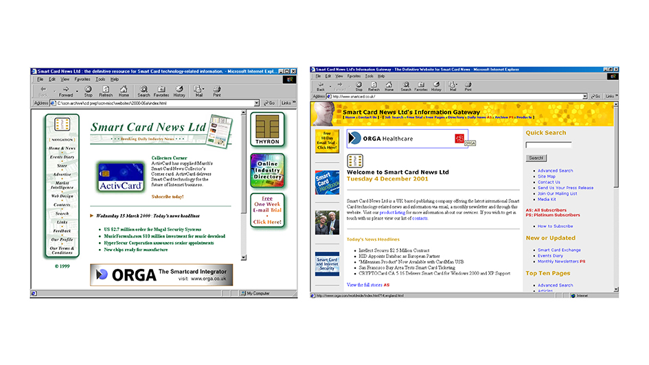
Two HTML layouts for the company website. We were early adopters of javascript to power a gallery of smart cards, and we also carried advertising to support the business. One of the greatest assets for the site was its networking capability, and we maintained strong links with the technologists and industry developers who built the smart card infrastructure. The Industry Guide was migrated from an A4 paperback book, and also proved to be extremely popular and a valuable resource in the sector.
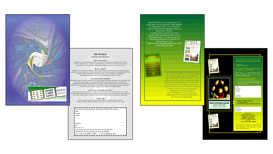
Direct marketing materials. We won a Royal Mail award for our direct marketing in 1997, and attended a big award ceremony in Brighton to mark the award.
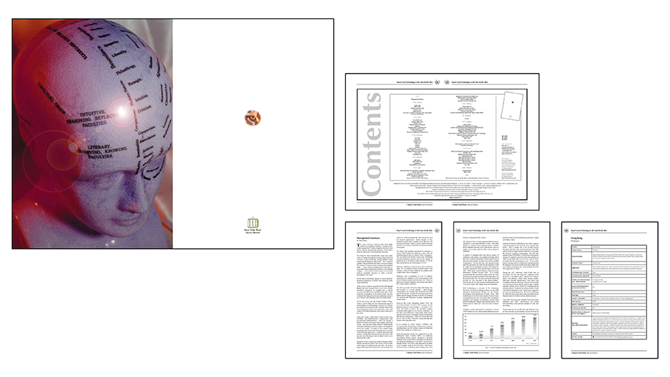
Smart Card Technology in the Asia Pacific Rim. A very successful industry report about the development of smart cards in the Far East.
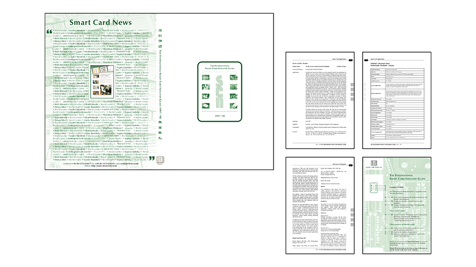
The International Smart Card Industry Guide 1997/98. This book was over 300 pages long, and my first major publication. Designed and laid out in Quark Xpress, using Quark’s then-new Book feature, which allowed chapter management. At this stage production was made from high resolution laser print outs pasted up by the printers and stripped into sheets of film. As we carried advertising in the book we received the ads as colour-separated positive films, which were also planned up in paste-up. Several long days were spent at the printers checking all the proofs, and signing them off in sections of 16 pages. The book was a big success.
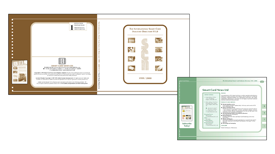
The International Smart Card Industry Guide 1998/99. Instead of an A4 book, this edition of the Guide was produced as a 900-page PDF, which was distributed on CD. Again, the artwork was laid out in Quark, and it was supported with a form on the website which companies used to submit their details for the Guide. This kind of publication is done with databases in CMS nowadays, but in the late 90s it was assisted by technology but very manual in terms of the workload. We started gathering the content almost as soon as the 97/98 edition was published, and it took a year to produce. The printers made us a simple wraparound cover and inlay tray with a post mark printed on the back. No stamps required.
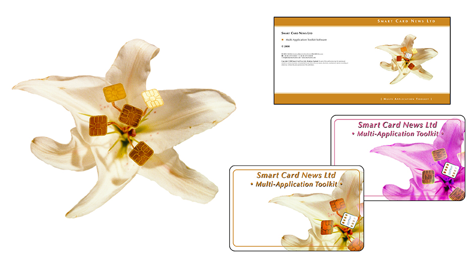
Multi-Application Toolkit. Imagery designed for this was initially planned for the website, but it worked better supporting this product. Nowadays we’d probably do with with CGI in Photoshop, but in the late 90s we bought a flower, some fuse wire and some loose chips and glued the whole thing together and photographed on 35mm film. Actually, I’d still do it that way because it really looks like it exists. I love creating physical objects and photographing them. Very satisfying.
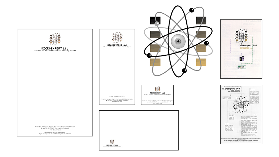
Microexpert was the sister company to Smart Card News, and ran the technical consultancy side of the business. This is the first iteration of the brand I designed in 1996, reflecting the ties to Smart Card News.
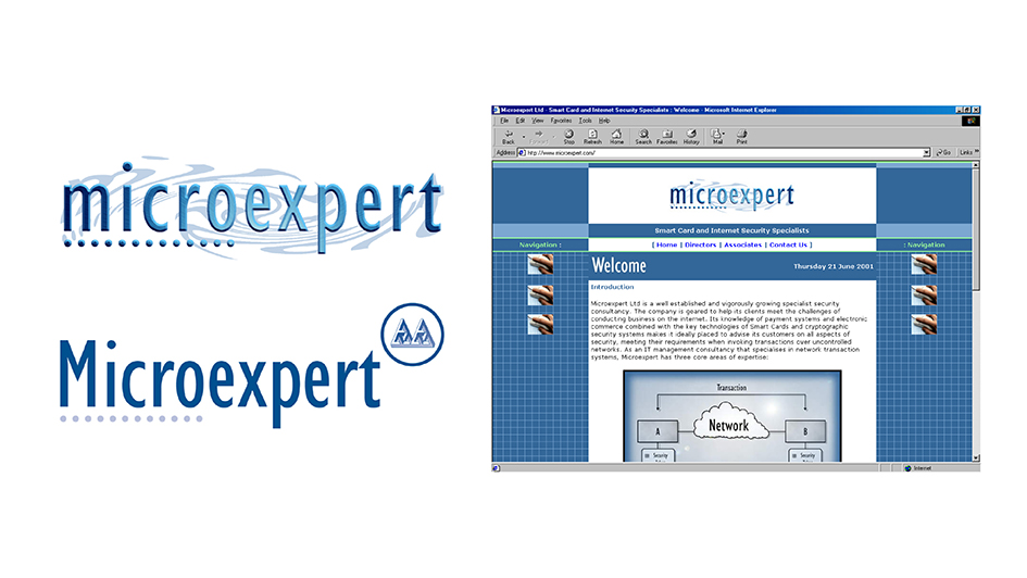
In the early 2000s I redesigned Microexpert’s brand to make it a bit more modern and I based it on MC Escher’s impossible geometry. That hand holding the mouse in the website layout is mine – almost 20 years younger than it is now.
